Leadership Edge PRO | EDU
Leadership Edge is a management and leadership development consulting company generally for physical therapy clinics (but not limited to just that industry). The client already had two typeface logos that they liked and were in use: one for the Professional side of the business and one for Educational (working with those still in school). I was asked if I could augment/improve what they had and add a brand mark.

They were already using two different colors to differentiate each business focus: PRO and EDU, which stands for Professional and Educational. I improved the readability by making the green, blue, and orange darker. The client wanted to drop the tagline from the logo.


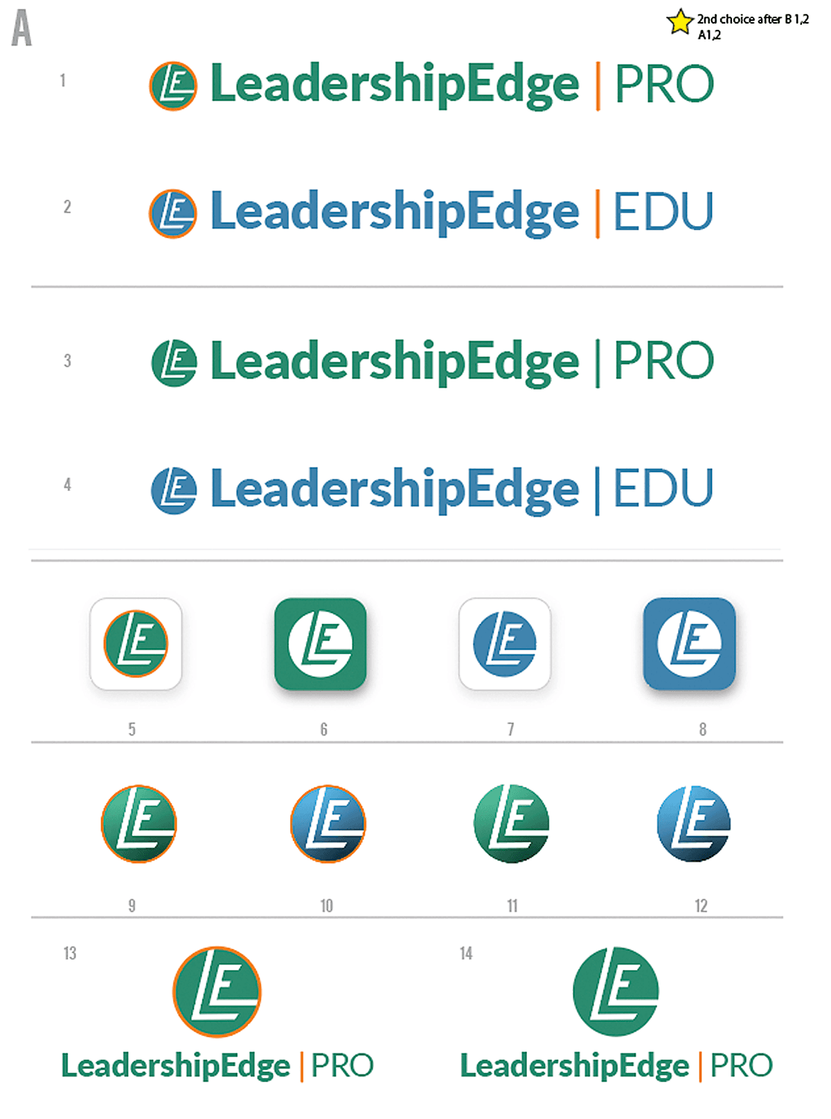
I played with using the letters ‘L’ and ‘E’ for a brand mark. I felt placing the ‘LE’ in a shield shape was a good option. “Leading into or through a battle.” A symbol of strength and protection.
I added a triangle to give LeadershipEdge a sense of motion while keeping it a simplistic shape. I played with various orientations of the triangle and multiple triangles. Some of them were placed as ribbons. Leaders, winners, and military members have ribbons and metals—a star shape because of the north, a guiding star that leads in the correct direction.

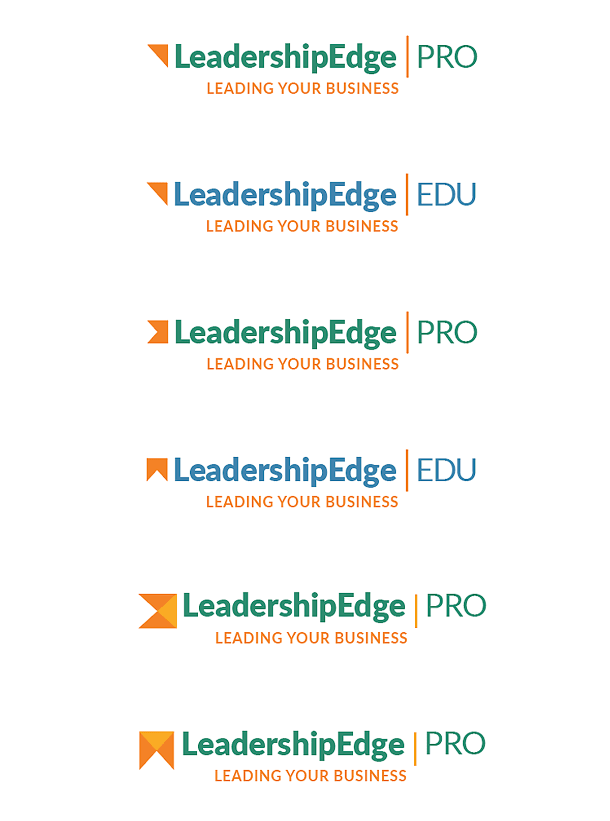


Ultimately, the client liked the double triangles pointing in the direction in the flow the reader would see them: left to right. The symbology can mean one arrow is leading another upward, forward.